How to get a logo people actually remember.
This is the trickiest part of the whole brand, and I’m not kidding you: the likelihood you get this wrong is about 90%.
Here’s why. You’re at the beginning of the business and you’re pumped up. You have no idea yet how this logo is actually going to get used. So you expect far too much from it, and you overdo it.
Why almost everyone gets it wrong
You’re designing for the version of the business in your head, not the one that exists. You haven’t yet seen your logo shrunk onto a business card, stretched across a truck, embroidered on a hat, or faxed in black and white.
So you load it up with detail it can’t carry. Two years later you rebrand, and you throw away the t-shirts, the truck wraps, and the business cards you already paid for.
There are two honest routes. The cheap do-it-yourself route, and the one that runs you about $800. Most people are shocked that anyone would pay $800 for a logo, so I’ll explain that one properly. You’re not paying for the logo. You’re paying for the process that gets you the best possible option.
Do it yourself, cheap
Workable, but only if you follow the five rules below exactly. Break one and you’re rebranding inside two years.
The $800 competition
150 top designers compete, you pick one and pay only the winner. This is the logo you keep for 20 years.
Option A: doing it yourself
Start from the truth
You are not a designer. Design isn’t a skill, it’s a talent. It’s like writing or singing. You cannot learn your way into being a good designer. With AI helping you, the very best you can be is average.
That’s fine. Average and correct beats ambitious and wrong. But it means the rules below aren’t suggestions. Take them seriously, or you’ll be paying for a rebrand in two years in old t-shirts, truck wraps, and binned business cards.
Five rules. Your logo has to pass all five.
At least 80% text
80% of the logo is the name of the company. Only 20% can be graphics, if even that much.
One bright color, one quiet one
One bright primary color that becomes your company color: green, pink, red. Then one secondary that complements it and stays out of the way: black, gray, something neutral.
The color has to be swappable
You should be able to change that primary color and have the logo still make sense. If swapping the color breaks it, the logo was leaning on the color to do its job.
It has to survive black and white
Strip all color out. If it stops working, it isn't finished.
Business card and billboard, same logo
The same logo has to work at both sizes. If you can't read every line on a business card, delete those lines.
Fail one, start over
If your logo fails any single one of these, do it again. Not tweak it, do it again. Otherwise you’re just scheduling the rebrand for later, at a much higher price.
Your logo tells people your name and sets your color. That is the whole job. Don’t expect more of it.
Use a generator, not a chatbot
Your safest DIY route is actually not an AI chatbot. Use an online logo generator instead.
The generators have some of these rules baked into their templates already: text-forward, two colors, scalable. A chat model has none of that built in. It will happily hand you a detailed illustration that dies the moment you shrink it.
Option B: the $800 competition
This is more relevant now than it has ever been. Because of AI, everyone is generating their logo the same way, so every logo ends up looking like every other logo. Average, competent, forgettable.
Start a contest on 99designs
Sign up at 99designs.com and run a competition for a logo and nothing else. No business cards, no social pack, no brand guide. Just the logo.
Pick the Gold tier, around $800
Not the cheap $200 one. The tier is what decides the caliber of designer who bothers to enter.
Turn on Guaranteed payout
Whoever wins is guaranteed the money. Designers can see that, and it's a large part of why the good ones show up.
Turn on Blind
Designers can't see what anyone else submitted. Everyone works in the dark, so you get genuinely independent directions instead of 150 variations on whoever posted first.
The brief is where you win or lose
Your brief matters more than anything else you do on the platform. The mistake is over-constraining it. Don’t bury them in conditions. Let the designers do their thing.
Give them the basics, set your brand color if you’ve already decided on one, and then add the two instructions that actually separate your contest from every other moving company contest on that site.
No moving-related imagery
No boxes, no trucks, no dollies, no houses. Say it explicitly in the brief. This is the single instruction that stops you getting the same logo as everyone else in the industry.
Drop “movers” from the name
Brief the logo on your core name without the word movers. Lime, not Lime Movers. The word lives on the website and the truck, not inside the mark.
Be honest about which owner you are
That second one is not general advice. Dropping movers from the mark is the top-of-the-line play, for owners running a long game: you’re building something you still intend to own in twenty years, and you’ll trade a little instant clarity now for a brand that travels much further later.
If that isn’t you, keep the word. A name that says plainly what you do will out-earn a clever one you never build on. Lime Movers is a perfectly good logo for an owner focused on booking jobs this year, and there’s nothing wrong with choosing that.
Why the long game pays off
If you’re paying $800, you want the best. And the best logo right now is one people actually want to wear.
Moving and storage is not a cool industry. Hand someone a hat that says Lime Movers and there’s a good chance they wear it on the job and nowhere else. Eventually you’ll print 6,000 t-shirts and 300 hats, and most of it gets torn and thrown out. Some of it sits in a closet and gets worn to sleep in, and the only reason it never leaves the house is the word movers across the chest.
Take the word off. Take the truck and the box and the dolly off. In a couple of years you’ll see people wearing your logo who have no idea what it is. That’s how you make a boring industry cool. More on this in the t-shirt and hat playbook.
Now go recruit the designers yourself
This next part is the one people skip, and it’s the difference between a good contest and a great one. Starting the contest is not enough. You go and get the designers.
Search the platform for top logo designers
Filter for designers who do logos and who have been active in the last 7 days. Active matters. A great designer who hasn't logged in for a month won't see your invite.
Invite them personally
Send the short message below. Keep it short and genuine, because you're sending a lot of them.
Do this on day one and day two
Not later in the week. The first 48 hours are when designers decide which contests are worth their time.
Invite message
Hey {NAME}!
Love your style.
I'd love to see what you come up with, so I hope you'll join the contest!
Why 150 beats 1
When you hire one designer, it’s hit or miss, and none of the ways it misses are your fault. He might be having a bad week. Your industry might not be his thing. His style might simply be out of date this year.
With 150 top designers around the world working in the dark on the same brief, some of them are just going to kill it. You’re not betting on one person having a good day.
Picking the winner
Cut it to 6
Select six for the next round and tell each of them what you want changed.
Run the vote again
Same method as the name: share the six with 20+ people and see what they actually pick.
Then you decide
Let friends and family vote, but the final call is yours. This is not a democracy, it's a sanity check.
Don't take the safe one
Here’s the part that feels wrong. Don’t pick the safest option. You should be a little uncomfortable with the logo you choose.
A memorable logo is not a safe logo. A memorable logo is slightly flawed, slightly unsettling. The one that makes everybody comfortable is the one nobody remembers.
This is your logo for the next 20 years. Pick accordingly.
One more thing after you pick
Once the contest is settled, message the winner directly and ask what they’d charge to design your business card and social media pack.
You already know their work, they already know your brand, and you’re dealing with the one designer out of 150 who actually understood it.
Who has done this
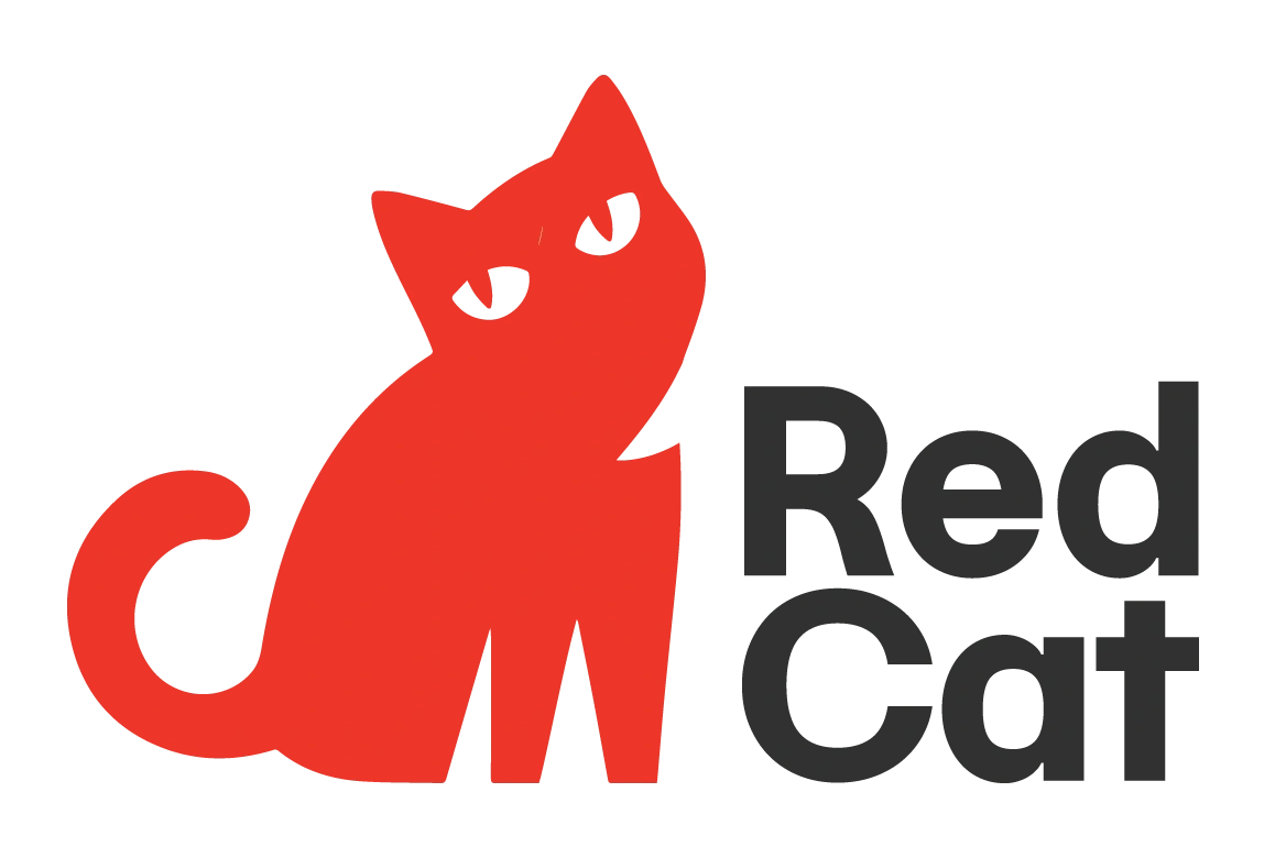
This exact process has been run by Einstein Movers and Red Cat Movers.
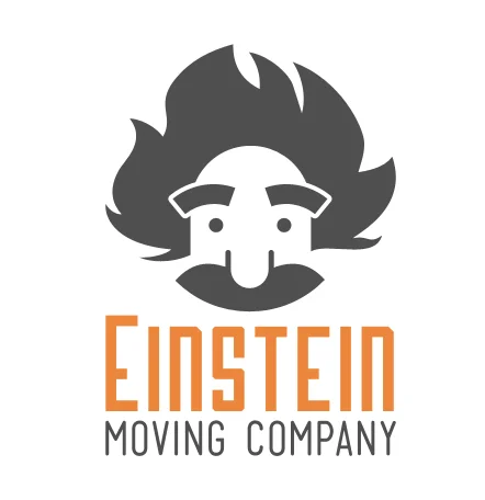
Look at the Einstein mark and notice what isn’t there: no truck, no box, no dolly. One bright primary color with a grey secondary doing the quiet work. The name carries the mark, and moving company sits underneath small enough that the logo still reads as Einstein first. That is the brief in this playbook, built.
The Red Cat mark is a different kind of proof. Love it or hate it, you have an opinion about it, which already beats most moving company logos. Same rule as Einstein underneath the reaction: one bright primary color, red, with asphalt black doing the quiet work as the secondary. And it hides the one thing a moving company logo usually can’t: that it belongs to a moving company. Nobody wants to wear a t-shirt that says moving company outside of work. Almost nobody would say no to a cat nobody can place. Put that mark on a hat or a tee, add a QR code somewhere on it (the tag, the sleeve) for the people curious enough to ask what it is, and you have merch people choose to wear instead of merch they leave in a drawer.
If you’ve run it too, email info@themovinglab.com and we’ll add you to the list.
The short version
- Assume you'll get this wrong. You're designing for a business you haven't run yet, so you'll overdo it.
- DIY rule 1: at least 80% text. The name is the logo. 20% graphics at most.
- DIY rule 2: one bright primary color, one quiet secondary.
- DIY rule 3: swap the primary color and it should still make sense.
- DIY rule 4: it has to work in black and white.
- DIY rule 5: same logo on a business card and a billboard. If a line isn't readable on the card, cut the line.
- Fail any rule and redo it. If you're doing it yourself, use a logo generator, not an AI chatbot.
- The $800 route: 99designs, logo only, Gold tier, Guaranteed payout, Blind.
- In the brief: no boxes, trucks or dollies. Dropping “movers” from the mark is the long-game play, for owners building something they'll still own in 20 years. Keep the word if that isn't you.
- Invite top designers active in the last 7 days, personally, on day one and day two.
- Cut to 6, vote with 20+ people, then you choose. Pick the one that makes you slightly uncomfortable.
- Message the winner afterwards for the business card and social pack.